Embroidery guide
Best Font for Embroidery: Lettering Styles and Minimum Text Size
The best font for embroidery has even, thick strokes and open shapes. Learn minimum letter heights by fabric and how to embroider names and monograms.
Quick answer
- The best font for embroidery at small sizes is a bold sans-serif: even, thick strokes, big open letter shapes, no hairlines or tiny serifs.
- Make capital letters at least 5 mm tall on woven and denim, 6 mm on T-shirt knit and polo piqué, and 7 mm on towel and fleece.
- Serif, script, thin and outline styles need far more height. Save them for big text.
- Always test-sew lettering on scrap fabric of the same type before stitching the real item.
The best font for embroidery is not the one that looks best on screen. It is the one whose strokes are wide enough for thread to cover them at the size you need. A font that reads perfectly on a business card can turn into a fuzzy line on a polo shirt, because thread has a fixed thickness and fabric moves.
This guide covers which font characteristics stitch well, the minimum letter height for each fabric (drawn to scale), how to embroider names step by step, and how to lay out an embroidery monogram.
What makes the best font for embroidery
Most machine embroidery lettering is sewn with satin stitches: the needle zigzags from one edge of a letter stroke to the other, laying shiny thread side by side. That one fact explains almost every rule about embroidery fonts.
A satin stitch needs room. If a stroke is very narrow, there is no space for the zigzag to form, so it sews as a thin running line or disappears into the fabric. If a stroke is very wide, each stitch gets long and loose, and it can snag. Wide areas are better sewn as fill (rows of short stitches, like a woven texture).
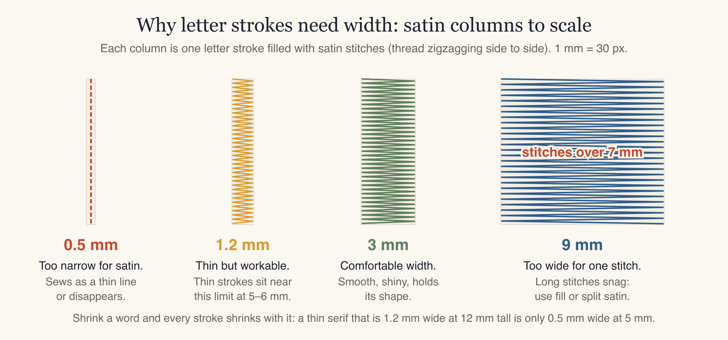
When you shrink text, every stroke shrinks with it. A serif font whose thin strokes are 1.2 mm wide at 12 mm tall has strokes of only 0.5 mm at 5 mm tall. The thick parts may still sew; the thin parts won't.
So when you judge embroidery fonts, look at these characteristics rather than the name of the font:
- Stroke weight. Bold or semi-bold weights stitch better than regular, light or thin weights.
- Even strokes. Low contrast between thick and thin parts. High-contrast fonts (very thin cross-strokes, thick stems) lose their thin parts first.
- Open counters. Counters are the enclosed or partly enclosed spaces inside letters, like the hole in "o", "e" and "a". Small counters fill in with thread and the letters turn into blobs.
- Simple shapes. No hairline serifs, swashes, inline stripes, distressed textures or drop shadows.
- Generous spacing. Stitched letters spread slightly as the digitizer adds pull compensation (a little extra width so stitches don't pull the shape too narrow). Letters that nearly touch on screen can touch on fabric.
- Few tight joins. Script and connected handwriting styles have narrow joins between letters that can bunch up at small sizes.
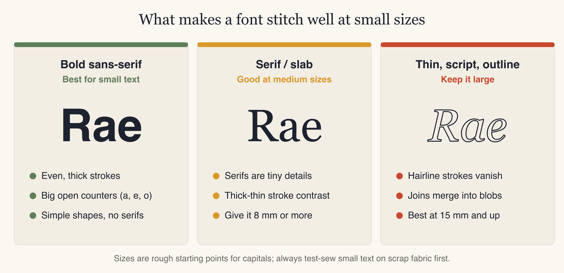
Embroidery fonts by style
There is no single best font for every job. Match the style to the size you have.
| Style | Typical look | Stitches well from (capital height) | Watch out for |
|---|---|---|---|
| Bold sans-serif | Plain, even, thick strokes | The fabric minimum (5–7 mm) | Very condensed versions with narrow counters |
| Rounded sans-serif | Soft ends, even strokes | The fabric minimum | Very light weights |
| Slab serif | Thick block-shaped serifs | About 8 mm and up | Serifs merging between letters |
| Classic serif | Thin serifs, thick-thin contrast | About 8–10 mm and up | Thin strokes vanishing |
| Script and handwriting | Connected, slanted, flowing | About 15 mm and up | Thin joins, small loops filling in |
| Thin, outline, decorative | Single lines, outlines, textures | Large text only | Details smaller than about 1 mm |
The heights for serif, script and decorative styles are rough starting points, not fixed rules. Fonts within one style vary a lot. A heavy script can work smaller than a delicate serif. The fabric minimums in the next section are the floor for everything.
Built-in machine fonts are worth a look too. Many embroidery machines include alphabets that are already digitized for stitching. For a quick name in a standard style, they are a sensible choice. Check your machine manual for the smallest size it recommends for each one.
Minimum letter height for machine embroidery lettering
Small lettering embroidery is where most lettering jobs go wrong. These are the minimum letter heights StitchFile uses for each fabric preset, measured from the baseline to the top of the capital letters:
| Fabric | Examples | Minimum letter height | In inches |
|---|---|---|---|
| Woven | Cotton shirts, twill, canvas, caps | 5 mm | about 0.20 in |
| Denim | Jeans, jackets, heavy canvas | 5 mm | about 0.20 in |
| T-shirt knit | Jersey, stretchy tees | 6 mm | about 0.24 in |
| Polo piqué | Textured polo shirts | 6 mm | about 0.24 in |
| Towel and fleece | Terry, fleece, plush, fluffy hoodies | 7 mm | about 0.28 in |
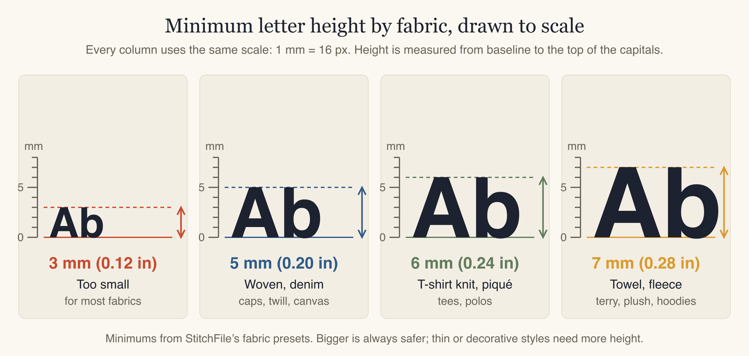
Why the numbers go up: knits stretch and move while the needle works, piqué has a bumpy texture that breaks up fine detail, and towel loops or fleece pile swallow small stitches.
A few practical notes:
- Lowercase letters are smaller than capitals. In most fonts, the lowercase "a", "e" and "o" are only about two thirds to three quarters of the capital height. If your text is mostly lowercase, check that the small letters still read clearly. Going a size up is the easy fix.
- These are minimums for clean, simple fonts. Thin, serif or script styles need more height, as in the table above.
- Measure the text, not the design. A 90 mm logo with a small tagline can still have 3 mm letters in it.
- Bigger is safer. If you are close to the minimum and the garment allows it, go a little larger.
Tips for small lettering embroidery
If the text has to be small (a tagline under a logo, a name on a cap side):
- Use the boldest, simplest font you can.
- Use capitals only. They are taller than lowercase at the same font size.
- Add a little extra letter spacing.
- Use satin stitch, not fill. Fill rows can't describe tiny shapes.
- Use high-contrast thread against the fabric (dark on light, light on dark).
- On towels and fleece, put a water-soluble topping (a thin film that dissolves in water) on top so the letters sit on the surface instead of sinking into the pile.
- If it still won't read, shorten the text or drop it. A clean logo without a tagline looks better than a tagline nobody can read.
Satin or fill for lettering
Satin is the default for most lettering: it is smooth and shiny and follows the shape of each stroke. Fill works better for big, bold letters whose strokes are too wide for one satin stitch, and for rough or textured letter shapes. Very large block letters are often filled with satin borders around them.
For more on how the two stitch types behave, see satin vs fill stitch.
How to embroider names: step by step
Names on shirts, towels, bags and baby blankets are among the most popular embroidery jobs. Here is how to embroider names so they stitch cleanly the first time.
- Decide where the name goes and how big it can be. Measure the space. A left chest name usually fits within 75–90 mm wide; a cap front within 50–60 mm. See the logo placement and size guide for common positions.
- Work out the letter height. Long names get small fast. If an eight-letter name has to fit in 60 mm, check that the letters still meet the minimum for your fabric. If not, use two lines, a shorter version of the name, or a bigger space.
- Choose a font by its characteristics. For anything near the minimum size, use a bold sans-serif. Save script and serif styles for larger names.
- Set the name in any design app. Type it, adjust the letter spacing, and set one thread color. Then convert the text to outlines (also called "create outlines" or "convert to paths") so the letters become shapes, and export it as an SVG. A large, sharp PNG also works.
- Turn the artwork into a stitch file. This is digitizing: deciding stitch types, directions, density and underlay. You can do it by hand in desktop digitizing software, use your machine's built-in lettering, or upload the artwork to StitchFile (more on that below).
- Check the preview at real size. Look closely at the smallest letters, the inside of "a", "e" and "o", and the gaps between letters.
- Hoop with the right stabilizer. Tear-away for wovens, cut-away for knits, cut-away plus water-soluble topping for piqué, tear-away plus topping for towels and fleece. The stabilizer guide explains each one.
- Test-sew on scrap fabric of the same type, then stitch the real item.
Making the name file with StitchFile
StitchFile turns uploaded artwork, including lettering, into PES, DST, JEF, EXP and VP3 files (all five in every purchase). You choose the finished size and the fabric. The fabric choice sets density, pull compensation and the stabilizer to use. Satin stitches follow the strokes of the letters, and if any lettering is smaller than the minimum for that fabric, the preview flags it and suggests a size that would work. The free Lettering edit lets you switch between Automatic, Satin and Fill.
Here is a real StitchFile stitch preview of a teacup design with the word "NouNou" on it, at 90 mm on the woven setting:
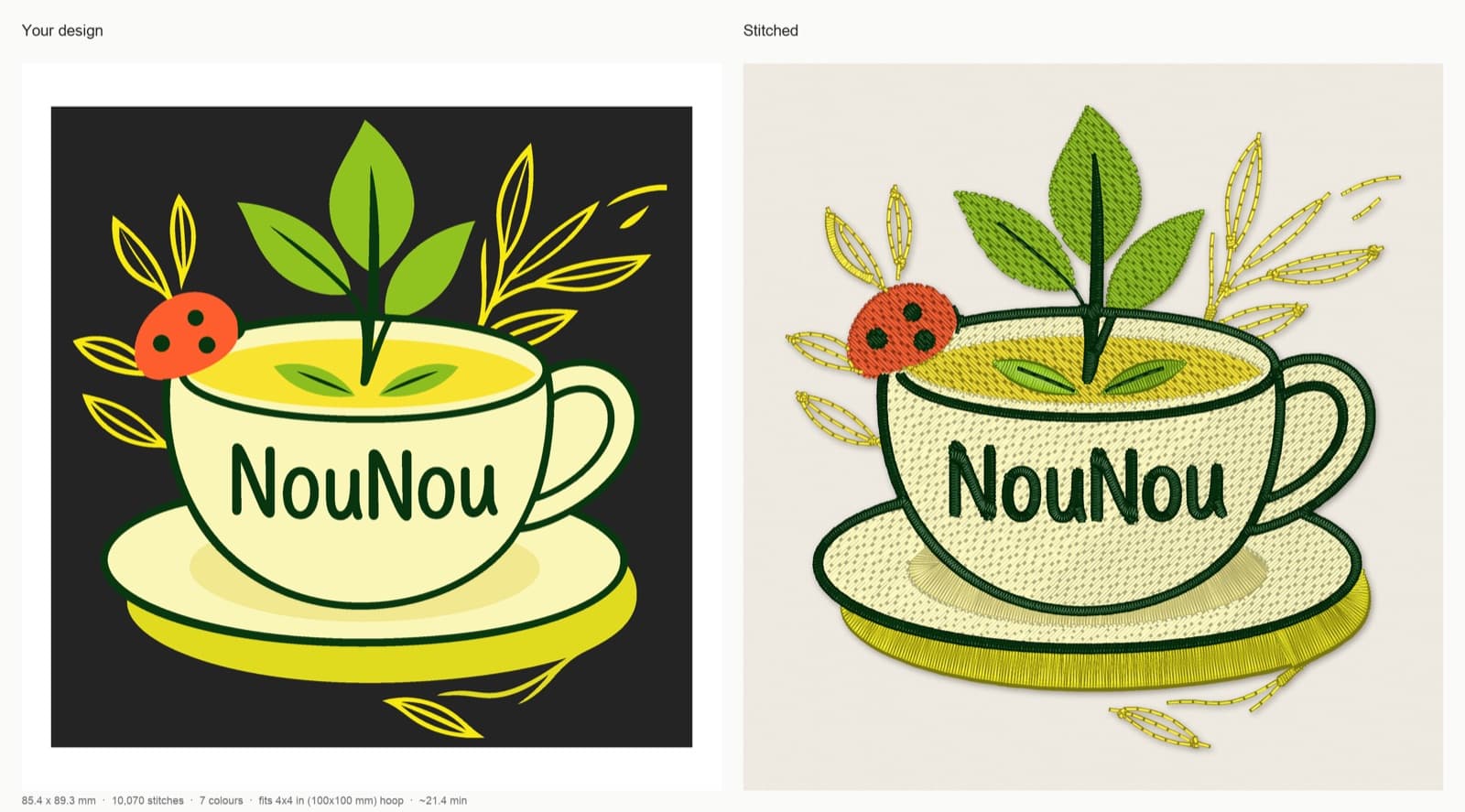
At this size, the capital N measures about 11 mm tall in the artwork and the lowercase letters about 7 mm, comfortably above the 5 mm minimum for woven fabric. Scale the same design down to 40 mm and the capitals drop to about 5 mm and the lowercase letters to about 3 mm, which is why lettering inside a logo often decides how small the whole design can go.
Embroidery monogram layouts
An embroidery monogram is a design made from a person's initials. Three layouts cover most uses:
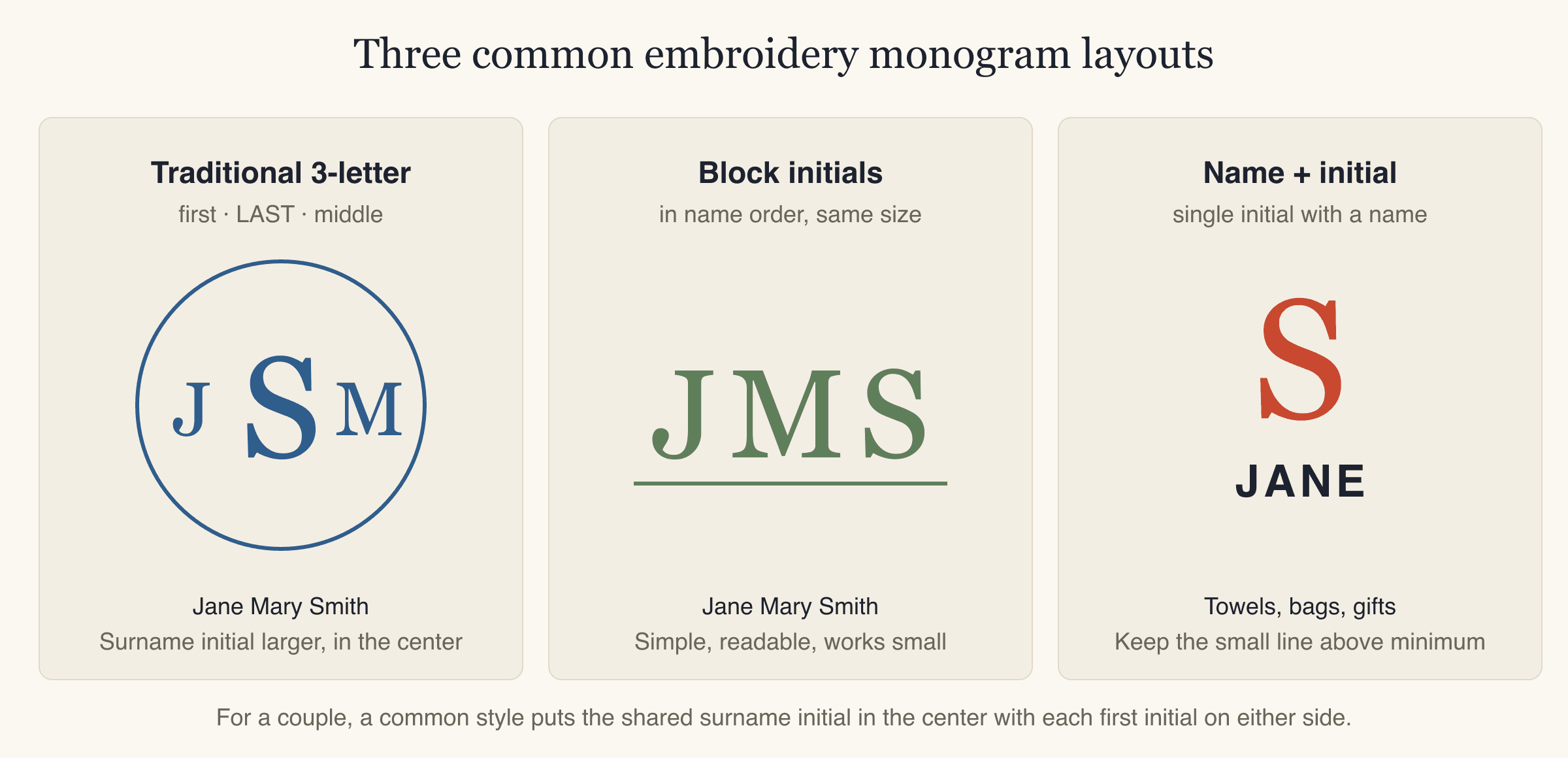
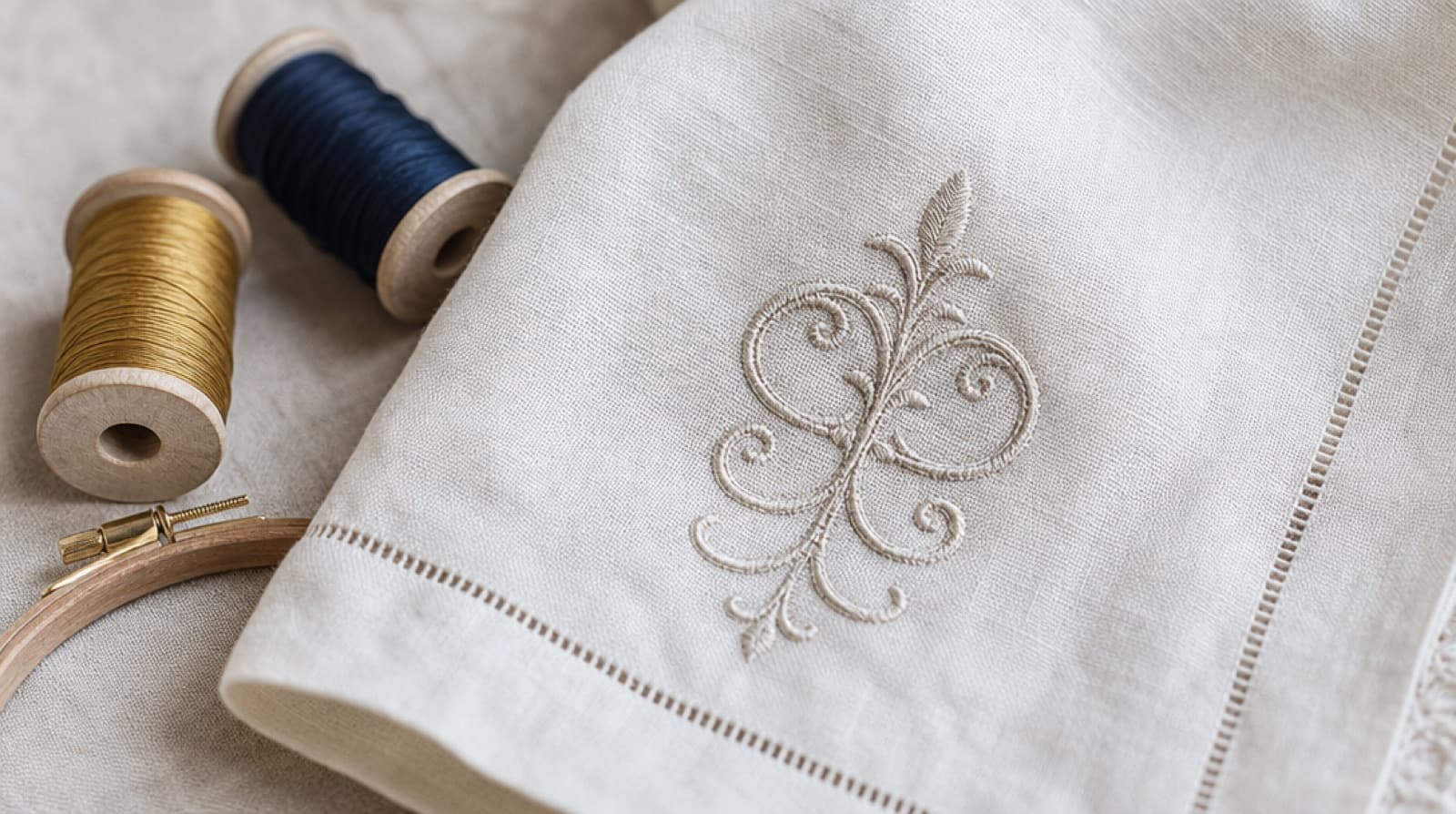
- Traditional three-letter monogram. First initial on the left, a larger last-name initial in the center, middle initial on the right. For Jane Mary Smith: J S M. This is the classic style for towels, linens and shirts.
- Block initials. All three letters the same size, in name order (JMS). Simple, readable and the best choice when the monogram has to be small.
- Single initial with a name. One large initial with the name in smaller letters underneath. Popular on towels, tote bags and gifts. The small line still has to meet the minimum height for the fabric.
For couples, a common style puts the shared last-name initial in the center with each first initial on either side.
Monogram tips:
- The small side letters in a three-letter monogram are what fail first. Keep them above the fabric minimum.
- Decorative monogram alphabets with flourishes look best large: think towel corners and pillowcases, not shirt cuffs.
- On towels, place the monogram where it shows when the towel hangs folded, and see machine embroidery on towels for hooping and topping.
Common mistakes with embroidery lettering
- Choosing the font on screen at a big zoom level. Print it or view it at the real finished size first.
- Ignoring lowercase height. A 6 mm capital can come with 4 mm lowercase letters.
- Thin or light weights. A "light" version of a good font is a different font as far as thread is concerned.
- Tight letter spacing. Stitched letters grow slightly. Give them room.
- Skipping the topping on towels and fleece. Letters sink into the pile and look thin and broken.
- Wrong stabilizer on knits. Tear-away on a T-shirt lets the letters distort. Use cut-away.
- Long text in a small space. A company name plus a slogan plus a phone number won't read at left-chest size. Cut the text, not the letter height.
- No test-sew. Lettering shows every small problem. Sew it once on scrap first.
FAQ
What is the best font for embroidery?
For small text, a bold sans-serif with even strokes and open counters is the most reliable choice. For larger text (around 15 mm and up), most styles work, including script and serif fonts. The font's characteristics matter more than its name.
What is the smallest text you can embroider?
As a practical minimum, make capital letters at least 5 mm tall on woven and denim, 6 mm on T-shirt knit and polo piqué, and 7 mm on towel and fleece. Smaller text can sometimes stitch on a smooth, stable fabric, but it is unreliable and hard to read.
Can I use any font for machine embroidery?
You can digitize almost any font, but not every font stitches well at every size. Fonts with thin strokes, small serifs, or tight joins need much more height. If a font has to be small, choose a bold, simple one.
How do I embroider a name on a towel?
Use a bold font with letters at least 7 mm tall, hoop the towel with tear-away stabilizer, and add a water-soluble topping on top so the letters don't sink into the loops. Test on a spare towel or a scrap of similar terry first.
Should embroidery lettering be satin or fill?
Satin works best for most lettering because it is smooth, shiny and follows each stroke. Use fill for very large, bold letters whose strokes are too wide for a single satin stitch.
What is the traditional order of a three-letter monogram?
First initial, then a larger last-name initial in the center, then the middle initial. For Jane Mary Smith, that reads J S M with the S larger. If all three letters are the same size, they usually go in normal name order.
Make your lettering file
If you already have your name, monogram or logo as artwork, you can upload it to StitchFile, pick the size and fabric, and see a free stitch preview in about 20 seconds, including a warning if any lettering is too small for that fabric.